Color Guide6 min read
The 8 warm neutrals that make small rooms feel bigger
A designer-approved palette that flatters natural light and hides everyday wear — with the finishes we recommend for each.
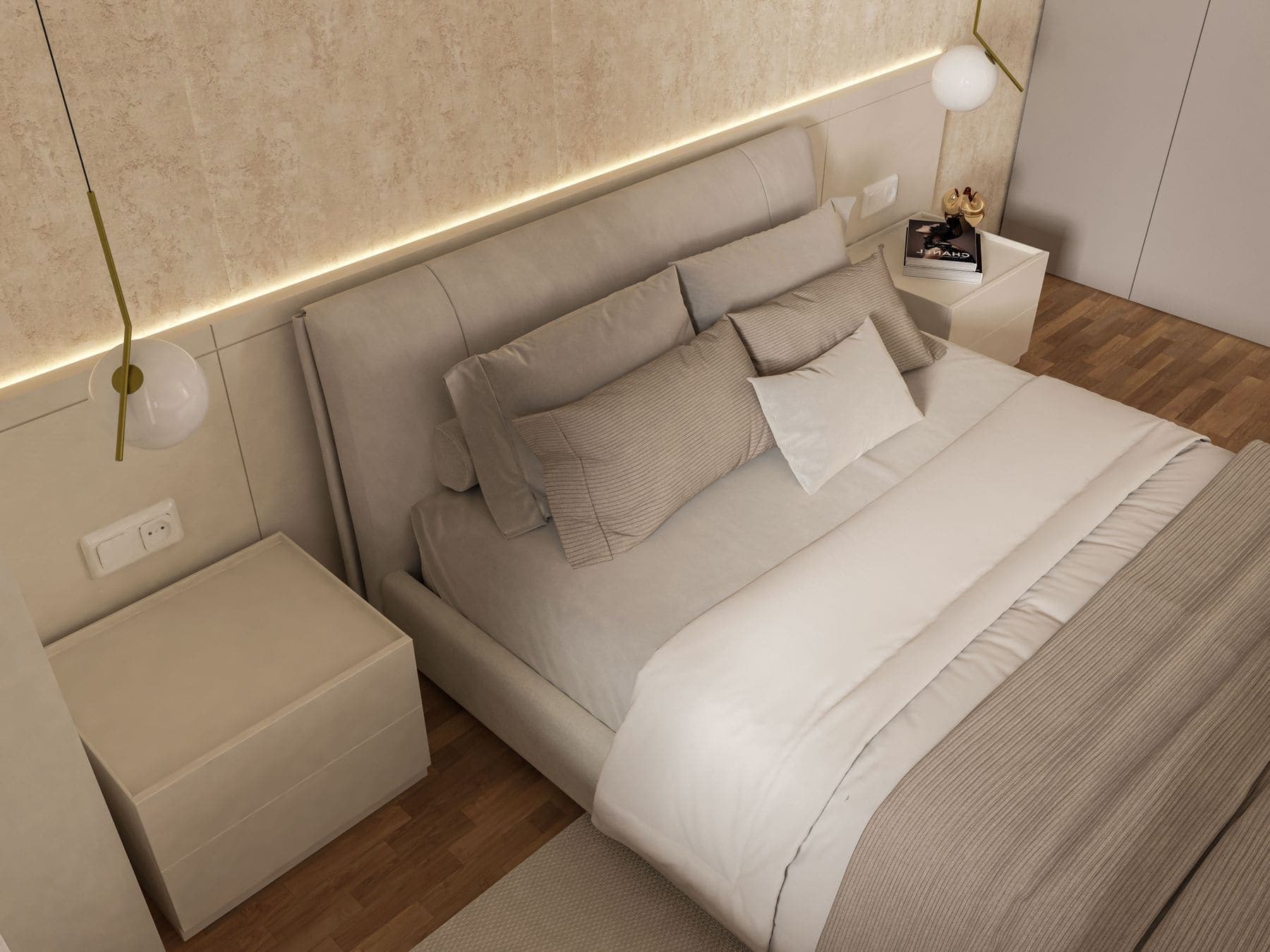
Small rooms are not made bigger by white paint alone. What actually changes the perceived size of a space is how evenly light travels across its surfaces — and warm neutrals do that better than the cool, blue-leaning whites most people reach for first.
A warm neutral carries a trace of yellow, red or brown in its base. In a north-facing room that trace counteracts grey daylight; in a south-facing room it keeps strong sun from bleaching the wall flat. Either way, corners stop reading as shadows, and the room feels like it continues past its edges.
What makes a neutral "warm"
Look at the darkest chip on the swatch strip, not the one you plan to use. That bottom chip exaggerates the undertone hiding in the lighter shades above it. If it drifts toward beige, taupe or greige, the whole strip is warm. If it drifts toward grey or lilac, it is cool — and in a small room it will feel colder than the swatch suggests.
The eight we keep coming back to
- Soft Linen — a barely-there cream that reads as white without the glare.
- Warm Chalk — our default ceiling tone; softens hard downlights.
- Pale Oat — the safest choice for open-plan spaces that flow into a kitchen.
- Greige Mist — grey enough to feel modern, warm enough to avoid the hospital look.
- Toasted Almond — excellent in hallways with little natural light.
- Muted Clay — a gentle depth for bedrooms; flatters warm timber floors.
- Weathered Stone — a mid-tone that hides scuffs in high-traffic areas.
- Antique Ivory — best paired with white trim for a subtle two-tone effect.
Match the finish to the surface
Colour is only half the decision. Sheen controls how much light bounces back, which is what makes a wall feel close or distant. Matte absorbs light and hides imperfections, so it flatters older walls. Eggshell gives you a slight glow and wipes clean, which is why we use it in most living areas. Satin and semi-gloss belong on trim, doors and anywhere that gets touched.
- Ceilings — flat or matte, always. Any sheen highlights every ripple.
- Living areas & bedrooms — eggshell for washability without shine.
- Hallways & stairwells — eggshell or satin; they take the most contact.
- Trim, doors & cabinetry — satin or semi-gloss for durability.
- Bathrooms & kitchens — a moisture-resistant eggshell or satin.
The most common mistake we see is a beautiful colour ruined by the wrong sheen. Get the finish right and a modest palette looks expensive.
Carry the colour past the walls
In a genuinely small room, painting the trim the same colour as the walls — just in a higher sheen — removes the visual lines that chop the space into segments. The room reads as one continuous volume. It is the single cheapest trick for making a box feel like a room.
If you would rather not gamble, our colour consultation is free with every project. We bring the fan decks, paint physical samples on your wall, and look at them in your light before anything is committed.

Written by
Tom Whitfield
Color Specialist, Brivon Painting